Our New Blog Design is Out!
OphirBlog
Have you noticed any changes on our blog?
You’re right, we’ve run a complete redesign. With the growing number of our regular and new readers, we’ve decided to make our blog more user friendly and accessible.
So what’s different?
Here are some of the main design changes you will see on our blog:
An easier way to get to our social media channels

Just click on the relevant icon below the title and you’re on our social media feeds! On our social accounts, we do lots of professional content sharing, bringing you the best updates, technical tips and industry news that are relevant to your daily work – so feel free to follow us there as well (you can read more about it here)…
A more visible way to filter the most relevant content for you
Filter by Categories

Our new header offers you 3 main categories to filter by: Power & Energy Meters, Laser Beam Profilers and LED Meters.
There you’ll find products/ industry updates, performance tweaks and videos. We will also write about us – our team and our experiences.
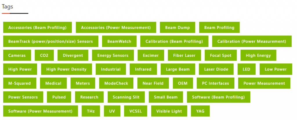
Filter by Tags
You’ll also be able to filter your search through our “tags” section which is now more prominent in green at the bottom. By clicking on a desired tag you’ll be able to see all content related to it.

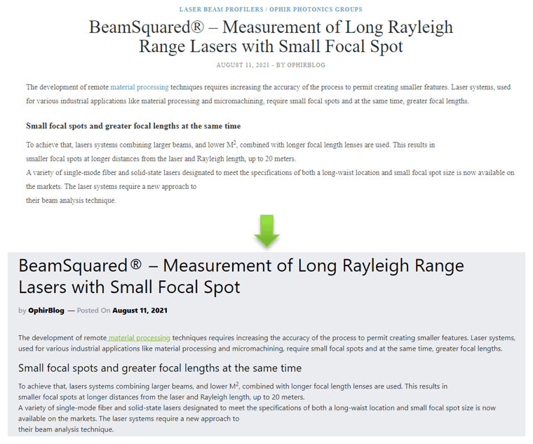
Modified fonts
We’ve made our fonts bigger so they are easier to read, and we’ve improved background contrast.

100% Innovation driven
The change is not only tied to design tweaks. We will also be bringing innovative articles (e.g. future trends) and will combine new surprising widgets to make it even easier to consume our content and become the ultimate laser measurement expert! (stay tuned…)
To get our monthly posts digest via email subscribe in the box at the bottom of our blog

Subscribe to receive laser news beamed to your inbox
Pick the subjects that are most relevant
- Industry news
- Power & Energy Meters
- Laser Beam Profilers
- LED Measurements